Posts

Showing posts from March, 2023

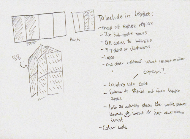
Secondary Research into 'Outdoor' Brands

Image
Whilst I now have a general direction of my design/layout, I think that it will be useful to look at the logos and identities of other brands as currently, I have not thoroughly considered my typefaces and how my type will interact with the front cover. The logos below are all the most popular 'outdoor' clothing & equipment brands found on 'Cotswold Outdoor' (Outdoor chain that stocks various different brands). I also think that maybe taking a focus onto the projected idea of an 'active outdoors' lifestyle within my leaflet could work to get people interested with the rail trails that may not be drawn to it as an idea otherwise.  Throughout nearly all of these brands (excluding the more upper-luxury brands such as 'Rab), a sans-serif typeface is used which creates a energetic visual image whilst a less 'curved' letter-shape creates a feeling of trustworthiness and safety - crucial to give customers reassurance. Another interesting thing used in a

Initial Construction of Leaflet

Image
Developed Wireframes  Before I could begin to construct my initial designs in more detail, I felt that it would be necessary to refine and visualise my layout further first. This made me thoroughly consider which sections should be laid out in which position throughout my leaflet to create the most impact, especially ensuring that I include QR codes within the layout. Whilst it can be hard to visualise the folds digitally, I plan on printing out my initial designs to see how well they flow when actually in use. Compared to my previous sketched layout, I noticed that it would be necessary to add an additional fold down the horizontal centre of my leaflets. This is important as it must be able to fit into the pockets of walkers and a smaller size is much more successful for this. However, this also meant that I had to envision the layout in a different manner and how the experience is impacted by having a smaller cover and how text could no longer flow completely across the pages vertica

Refined Rough Ideas

Image
Refining Fold/Layout   Front Back To ensure my leaflet is accessible to a the broad range of people within the Worcestershire community, I have decided to keep my leaflet quite sparse whilst including vital information and the requirements set within the brief. I am able to do this being the QR codes to the WRCP webpage which will have further information surrounding the entire scheme. After viewing the front cover, you will then open up the leaflet and be greeted by the line-map of the entire scheme. I feel that an audience seeing all the places you can visit, linked via walks will immediately grab their interest, prior to delving more in-depth into sub-routes which is visible after that page is opened. This also creates a journey into the leaflet in a logical way that does not present the viewer with too much information at once. Next, I must look into how my stylist ideas can be applied to this layout in exciting yet simplistic ways.

Client Feedback - Where Next?

Image
 " Like the bright, eye-catching colour and curves of the simplistic style.  I particularly like your abstract pattern idea and both the colours and style could work well if done so that they are identifiable as the countryside. 1) I think I prefer the traditional fold method but that maybe because I’m not very good at visualising your initial idea (sorry, that probably doesn’t help much!).  2) While the colours don’t shout countryside to me they are eye-catching and look pleasing together. 3) I do think the map’s function would be to demonstrate the interesting places the walk goes through rather than just show which station follows another.  The interest is in the walks and things people might see on the way.  4) Iconic representations of towns might work well although I don’t think there should be a mix of photographs and illustrations.  5) As mentioned earlier, I particularly like the abstract pattern idea and the colours. I wonder how easy (or difficult) it would be to produc

Pictograms & Semiotics

Image
 Olympic Games Communicate to a global audience without written language, Olympic Games created the struggle of trying to direct and guide an international audience. Olympic pictograms initially created in 1964 by Tokyo who realised people coming to the event would mostly not be speaking Japanese.  Wayfinding system using directly pictograms - tell stories with icons. Lillehammer Winter Games pictograms - based on Nordic ancient history of cave paintings. Semiotics 'The theory of signs' Signs can be a range of things such as gestures, facial expressions, marketing, music, films, food, clothes, primitive symbols etc. For instance, apple can just mean an apple, or it can mean healthy. A stop sign means stop, but it can also mean danger.  Immanuel Kant - German Philosopher who dealt with teleology and aesthetics. Ferdinand de Sassure- Swiss linguist, developed the theory of sign, signifier and signified. Roland Barthes- French Literacy theorist- "Mythologies' - semiotics