New Developments
New Developments in Design
From my last design, I felt that my cover whilst by itself it was very pleasantly appealing, it did not suit the rest of the layout due to how intricate the design was with a multitude of different colours and details. Instead, I decided to play around with breaking up the pattern and using it as a background art-work, supporting a larger piece of typography that creates an exciting and energetic feel, similar to what I found most 'outdoors' brands build. Whilst this panel is still being developed, I feel that this is a big change and will visually impact the rest of the leaflet, especially with the versatility of the pattern which I can apply in other areas.
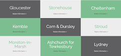
Another big change from recent development is the sub-line section. I really liked what I had prior but the more work I put into it, I felt that it was too 'rigid' and didn't make me feel like I would want to go out and explore the rail trails. Instead, I decided to fully deconstruct this page and see how I could make a wayfaring-map system that would inspire people to explore whilst still being easy to follow as a stop-by-stop line diagram which ended up as a 'stamp' card (similar to how loyalty cards are used). I really like this idea as a concept and plan on developing the design and layout further to make the stamps work more as a line map to ensure complete usability. Doing this has also minimised the sub-line spread from the entire four panels of this side of the leaflet down to two, leaving me with much more room to add more information, illustrations & photographs or even space for other sub-routes to be added in the future.


Comments
Post a Comment