Peer Assessment Feedback & User Testing
To carry out my user testing, I am going to create a survey questionnaire and send it out over social media to a large group of people, aiming towards both groups of people that have no creative foundation and will give me honest feedback surrounding the use of the leaflet as a product and those who do have creative knowledge who will give me some extra feedback on the aesthetic appearance and intellectual flow of the leaflet. I feel that an online survey will allow me to target as many people as possible to gather the most feedback being it can be shared in a much more efficient way compared to paper questionnaires which I would only be able to hand out to those close by.
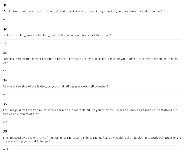
In my survey, I asked users about the aesthetics of pages and how 'clear' the main elements are which gave me an understanding of both key areas of the designs success. After a day of testing, I received feedback from 13 different users, with most of their results overlapping which gives me a solid database to progress from. Below are the results from each person.
From creating surveys in the past to receive user testing, I have found that the way questions are positioned to those giving you feedback is crucial to the quality of the responses you get. Especially balancing the need to ask for feedback on specific elements whilst being broad enough to allow the audience to feel that they can give their honest feedback.
From the user testing, I have noticed that the full region line-map isn't accessible for a large audience, with some people finding it unclear what areas are covered by the sub-routes for example so this will be something to focus on. Other people also commented on the boldness of the front cover, saying that the image overlayed on the 'get explore' page could be less transparent and the footprint 'stamps' could be bolder to make the design more impactful. Other than this, the user's gave positive feedback about the rest of the design which helps me to solidify those elements and place my attention on the areas that require it the most.


Comments
Post a Comment