Posts

Final Developments/Design

Image
  Overall, I am very happy with my final leaflets and how my design has developed throughout the course of the project. Stripping away elements down to their most successful pieces has allowed me to create a clear and concise structure/appearance whilst still projecting a fun and exciting visual identity to broaden the target appeal. 

Peer Assessment Feedback & User Testing

Image
  Overall, I am very happy with my feedback and the improvements suggested to bring my final leaflet together. To progress further from here, I am going to look into a different way I can use a 'walking' illustration that is not the footprint used in the logo and doesn't look like it to not cause any confusion. I also think that taking a step back and reconsider the shades of colour I have chosen is a great idea to ensure proper legibility. It is always great to get feedback from others and prior to scheduling these improvements, I am going to carry out a phase of user testing on my current prototype to see if there is anything else I can bring before the design appears finalised. To carry out my user testing, I am going to create a survey questionnaire and send it out over social media to a large group of people, aiming towards both groups of people that have no creative foundation and will give me honest feedback surrounding the use of the leaflet as a product and those w

New Leaflet Concept (for peer assessment)

Image
 

New Developments

Image
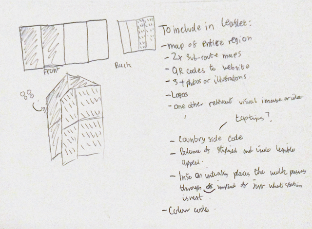
New Developments in Design From my last design, I felt that my cover whilst by itself it was very pleasantly appealing, it did not suit the rest of the layout due to how intricate the design was with a multitude of different colours and details. Instead, I decided to play around with breaking up the pattern and using it as a background art-work, supporting a larger piece of typography that creates an exciting and energetic feel, similar to what I found most 'outdoors' brands build.  Whilst this panel is still being developed, I feel that this is a big change and will visually impact the rest of the leaflet, especially with the versatility of the pattern which I can apply in other areas. Another big change from recent development is the sub-line section. I really liked what I had prior but the more work I put into it, I felt that it was too 'rigid' and didn't make me feel like I would want to go out and explore the rail trails. Instead, I decided to fully deconstruct

Secondary Research into 'Outdoor' Brands

Image
Whilst I now have a general direction of my design/layout, I think that it will be useful to look at the logos and identities of other brands as currently, I have not thoroughly considered my typefaces and how my type will interact with the front cover. The logos below are all the most popular 'outdoor' clothing & equipment brands found on 'Cotswold Outdoor' (Outdoor chain that stocks various different brands). I also think that maybe taking a focus onto the projected idea of an 'active outdoors' lifestyle within my leaflet could work to get people interested with the rail trails that may not be drawn to it as an idea otherwise.  Throughout nearly all of these brands (excluding the more upper-luxury brands such as 'Rab), a sans-serif typeface is used which creates a energetic visual image whilst a less 'curved' letter-shape creates a feeling of trustworthiness and safety - crucial to give customers reassurance. Another interesting thing used in a

Initial Construction of Leaflet

Image
Developed Wireframes  Before I could begin to construct my initial designs in more detail, I felt that it would be necessary to refine and visualise my layout further first. This made me thoroughly consider which sections should be laid out in which position throughout my leaflet to create the most impact, especially ensuring that I include QR codes within the layout. Whilst it can be hard to visualise the folds digitally, I plan on printing out my initial designs to see how well they flow when actually in use. Compared to my previous sketched layout, I noticed that it would be necessary to add an additional fold down the horizontal centre of my leaflets. This is important as it must be able to fit into the pockets of walkers and a smaller size is much more successful for this. However, this also meant that I had to envision the layout in a different manner and how the experience is impacted by having a smaller cover and how text could no longer flow completely across the pages vertica

Refined Rough Ideas

Image
Refining Fold/Layout   Front Back To ensure my leaflet is accessible to a the broad range of people within the Worcestershire community, I have decided to keep my leaflet quite sparse whilst including vital information and the requirements set within the brief. I am able to do this being the QR codes to the WRCP webpage which will have further information surrounding the entire scheme. After viewing the front cover, you will then open up the leaflet and be greeted by the line-map of the entire scheme. I feel that an audience seeing all the places you can visit, linked via walks will immediately grab their interest, prior to delving more in-depth into sub-routes which is visible after that page is opened. This also creates a journey into the leaflet in a logical way that does not present the viewer with too much information at once. Next, I must look into how my stylist ideas can be applied to this layout in exciting yet simplistic ways.